as we arrived we were very fortuantely given two T10 travel tickets, by this woman leaving to go home, which supposedly allow for ten journeys on the underground system. we used these same tickets all holiday and didnt have to buy more and we definitely did more than ten journeys!
the design of the tickets is considerably different to the train tickets seen in england. the colour scheme i think is a lot nicer and a lot less garish, the dark mint green contrasts well with the off white stock and the layout, with the simple logo based iconography, reads clearly and boasts a mondernist edge with a european shape background.
the view from the aparetment shows the beuty of the inner city architecture. the layout of the city is quite winding and narrow and very bustling and because the city is very flat you can see for miles when at any height.

https://c3.staticflickr.com/3/2735/4170731853_f86d82d10a_b.jpg

https://c4.staticflickr.com/4/3621/3470875332_22acd24b68_b.jpg
on the first full day we were there we decided to visit the museum of contemporary art (MACBA) because it was close and because we thought it would be a good introduction to the creative vacation to come. the building is in an area full of creativity, with various art and design shops around, and a major skate spot just outside, which was good to watch while having a drink. there was also a long standing mural by keith haring which was awesome to look at.
the museum mid construction -
http://www.macba.cat/uploads/20121031/Edifici003_770x491.jpg
keith haring has developed a very recognisable and original illustration style that lends itself so well to the surrounding area of the museum. the simplicity of the line work, contrasted with the intricacy of the detail within the characters and flow of the piece, works in line with the architectural structure of the museum itself. the museum appears simple from the outside but is actually a vast network of different levels with rooms and spaces generating much more volume than expect from the outside view.
Keith Allen Haring (May 4, 1958 – February 16, 1990) was an American artist and social activist whose work responded to the New York City street culture of the 1980s by expressing concepts of birth, death, sexuality, and war.[1] Haring's work was often heavily political[2] and his imagery has become a widely recognized visual language of the 20th century.
http://en.wikipedia.org/wiki/Keith_Haring
http://www.haring.com/!/art-work/138#.VVYH4xep1pk
there was a number of different exhibitions featured at the time of our visit which was great because we got to experience a multitude of different works and contexts. there were some really politically motivated exhibitions, and some were more artistically or conceptually driven.
i collected a load of ephemera related to the different exhibitions which was interesting to read but also to look at the graphic styles applied. i took particular note of layout and format.
there were a number of leaflets at the entrance of the museum which i looked at and took some of for collection. the museums brand indentity extends to so many different things and the range of ephemera was vast. the staggered separation evident in the macba logo is translated into many different forms including titles, sub headings, flyer info and more. i think the logo works really well to portray the word separation while maintaining the simplicity it depicts.
the intricacy of these pop out books was amazing to observe and must have taken a long time to develop and produce becuase the pop outs are hand drawna dn hand cut.
these masks are featured as part of a video installation questioning the male/female role and how sexism impacts modern societies. it was very artistic and conceptual however it illsutated a lot of thruths about the 'female role' and the male gaze.
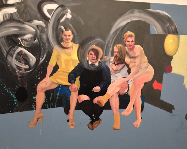
i wasnt quite sure as to what this piece represented but the quality and contrast in the painting was amazing and really interesting to observe.i particularly liked the contrast between detail and simplicity of shape. some aspects of the piece are almost photo realistic, portraying facial expression and mood, while other aspects merely suggest that a figure is present and do not offer more than that.
some of the photography was brilliant too but i particularly took not of the layout. the evidence of the consideration for 'the grid' was clear to see and some of the artists/curators had, i considerd, extended muller-brockmans theories of grid structures to a more abstract extent.
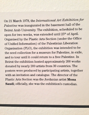
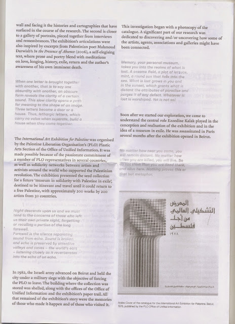
there was an exhibition on the palastinian conflict and it had been taken from beirut and was intended to be shown in museums around the world. the socio-political/activist graphic design displayed ranged from very simple and mininal impacting pieces to more graphic and literal ones, all making a mark in their communicative intent on the audience.
i really like the two tone contrast in this piece and the use of shape to convey the message of political activism in the form of wheat paste or political graffiti (hence the brush shape).
this piece is clearly more conceptual and invites the audience to engage with the piece and consider its meaning, prompting acadmeic and critical thought.
literal translation: Palestinian poster. this poster aims to depict the numerical impact of the conflict on palestinian lives and is a powerfully simple infographic that uses icons to illustrate its communication.
i like the use of the bauhaus esque font on this poster as it contrasts well with the block font of the '15'. the internal image shows the severe desitruction that occured which is impacting when viewed.
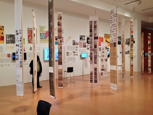

some of the typographic pieces were awesome to look at and consider. as i am interested in typography this was something that i took note of throughout the vacation and tried to record for further reflection.
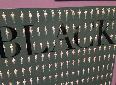
i found every graphic consideration made to design this piece awesome and really successful. the simple block sans at different weights and cases lend themselves well to the grid structure applied and the colour separation that is tied in. the colour scheme contrasts well and is split with a simple black, using negative space to feautre the green text atop the strip.
i think this set of works was really interesting and explored typography and embossing through resin blocks of dirrenet forms, colour values, and mixes producing some really intersting aesthetics.
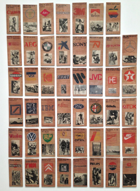
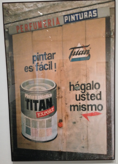
there were also a number of logo studies which were also really interesting. some displayed older versions of companies branding and others were the artists refelections on such logos.
these logos have been extended, reverted or developed from the current versions and present interesting graphic additions.
i thought these hand painted logos laid in a square grid format were really bold both in colour and form. the quality of line was brilliant especially when contructed with brushes.
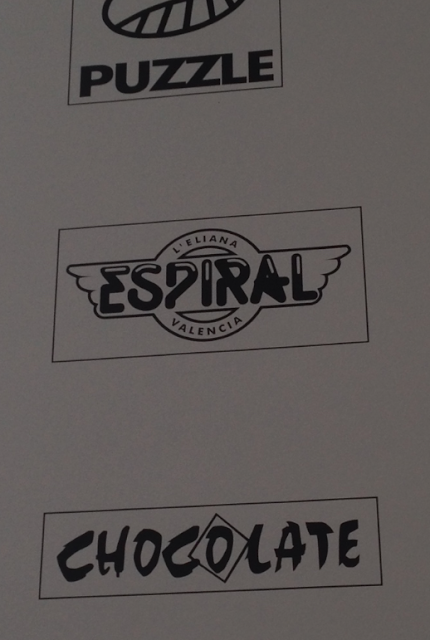
i really like the middle logo in the below image which was cut out of black vinyl. the letter forms work really well as a set, relating well to the winged border, and the negative space highlights are very crisp.
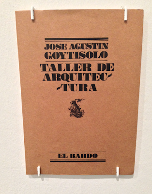
i also like the type setting executed on this book cover and inspired me to do some of my own.
these skateboards, painted in acrylic and gouache (as far as i could tell), were beautifuly crafted and executed and posed a revolutionary question with an activist tone. the links between skateboarding (a very popular sport in barcelona) and protest is considerable as the punk era was heavily associated with skateboarding and activism both.
this collection of match books really engaged me. ive always liked match books as a concept, as a collectible, as a graphic advertisment, and because they have been around for so long and still exist. some of the designs were awesome and were like a window into past graphic styles.
there was an exhibnition on type setting and typographic exploration which i found really interesting. it made me consider the few typography sessions we had with graham in second year and how readability, legibility and flow are really important considerations in acutal working type, not just aesthetic typography.
this typography exploration was my favourite out of the lot as it explores the word in many different fonts, weights, and sizes but together makes a P shape which i found really interesting and aesthetically engaging.

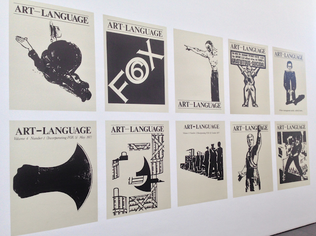
these pieces i thought were beuatifully laid out and the stock printed on had faded and gained that creamy yellow/brown look which only added to the effect, and brought out the colour in the type further.
this piece, just outside the museum, was beuatifully crafted. what particularly caught my eye was the wavy highlights on the birds' backs and the creases on the fingers. produced purely with spray paint, the artist had applied a very light pressure to the cap forcing it to almost spit tiny amounts of paint out leaving these dotted and incredibly thin lines which i admire greatly.
we spent the rest of the day wandering round and looking at the old architecture and scenery.
the gothic quarter cathederal was agreat representation of architectural styles that have since been lost somewhat in the city. it is clear that more modern buildings have derived from this style however the geometry and rugged structure that makes it up is heavily impacting and stands out greatly in the part of the city.
so epic...
i thought this was interesting as it is somewhat similar to nelsons comlumn in london.
i decided to do some more research to see if i could find any connection:
it is the Columbus monument, named after the explorer, but it was not made before nelsons column which was constucted in 1805.
It was constructed for the Exposición Universal de Barcelona (1888) in honor to Columbus first voyage to the Americas. The monument serves as a reminder that Christopher Columbus reported to Queen Isabella I and King Ferdinand V in Barcelona after his first trip to the new continent.[1]
http://en.wikipedia.org/wiki/Columbus_Monument,_Barcelona
this building caught our attention on multiple occasions as it was located just up the road from our appartment and by a coffee shop we sometimes drank at. it was borded up and looked like it hadnt been used in a long time however we were both very intrigued as to what it used to be. i could translate the title as 'the school of applied arts and offices of artists' but we were initially baffled beyond that point. after some further research we found out that the building had been decommissioned and the school had moved to another location. the new building was very boring and didnt poses anywhere near as much style or beauty.
new building:
http://en.wikipedia.org/wiki/Escola_de_la_Llotja
the next day we spent some time at the beach relaxing and then proceeded with our plan to visit Gaudi's Park Guell. we decided that it would be better to visit in the late afternoon as the heat was quite intense during the day and so we arrived at around 5:30pm and began to look around. the park is a beautiful expose of Gaudi's architectural imagination, in which he draws influence from various aspects of nature such as fish scales, trees, sand dunes, and much more. the park is meant to close at 8 however there was no one telling us to leave and none of the gates were closed so we decided to stay and watch the sun set and take in the beautiful view. we then proceeded to explore the park at night which is a very enchanting and different experience to have.
this
image was of thefairground: parc d'attractciones de tibidabo (the
mountain was called tibidabo) at night. we intended to go up thew
mountain and look around on another day but on the day we were going to
it rained and so we made other plans.
the following morning we got up early in order to visit Gaudi's Sagrada Familia, a cathederal that was designed by the architect and began being constructed in the 1880's. the construction is still going on and it is estimated not to be completed until 2026 (144 years after building began). the building is a clear centre piece to the barcelona city scape, towering above almost all other buildings in the flat land area. its beauty and intricacy is indescribable and it is easy to get lost in the immense detail applied to the structure.
there was a small museum in the underneath of the cathederal that explained Gaudi's architectural influence (nature and natural geometry) and contained a workshop area that both displayed smaller replica sections of the construct and explained the mechanics behind them. this shed a lot of light on the thinking and planning behind the building which was amazingly intricate and complex.
the architect and designer/sculpter Josep Maria Subirachs took on much of the design and production, especially the many statues situated all over the cathederal, and the museum features a lot of his developmental work which was very interesting and inspiring to see.
http://reiseziele.ch/wp-content/uploads/2013/10/736px-Sagrada_Familia_1915.jpg
this is an image of the construction of the cathederal in 1915. this is an amazing image to look at because it shows both the early stages of construction and the amazingly different scape of the city to what it has become 100 years later.
the
geometric consideration applied to subriachs' sketches and designs was
incredible and really inspired me to explore geometrys relationship to
art and design.
i decided to collect some more of his illustrations because i really admire his style


https://www.google.co.uk/search?q=josep+maria+subirachs&safe=off&biw=1276&bih=698&source=lnms&tbm=isch&sa=X&ei=NBdWVeKoN-nW7QbW-YPwBg&ved=0CAYQ_AUoAQ#safe=off&tbm=isch&q=josep+maria+subirachs+drawings
the workshop in which the designers and architects work on scale models of the building and the areas yet to come in order to develop the process for building
my favourite part of the cathederal was the hundreds of stained glass windows that projected an entire spctrum of colour around the giant hall. the seamless blend between the different hues was so beautiful and cast such impacting lights around the space. im a sucker for gradients so these windows had me captured for a long while!
the patterns and symetry found throughtout the cathederal are really amazing and a lot of fun to try and spot.
having completed our tour of La Sagrada Familia we decided that we would continue our Gaudi themed day and proceed to visit the Casa Batllo which was closer to La Rambla.
when we got there we all got given a audio/visual tour tablet that was complete with augmented reality. this was an amazing feature as it helped one picture how the house would have looked in its original use. this was a really incredible addition that added a whole new element to the experience, however, we quickly realised that we, along with everyone else, were walking round and looking at everything through the tablet instead of actually observing it in real life! and so we made a pact that after the virtual tour we would have a real look and discussion about everything we could see.
the
light well was a really interesting aspect of the house as the tiles
were a blend of different tones of blue that went from darker at the top
to lighter at the bottom to both help the light reflect all the way
down and make it appear like, from the bottom, all the tiles were the
same hue.
as part of the numbering system for the rooms, or rather the lettering system (as the audio guide informed us), Gaudi had developed a personal and original font to label each door head with. the system worked in alphabetical order and ascended with the height of the building. the lettering is painted on with gold leaf and was hand done by Gaudi himself.
i decided to collect some images of some other of the doors:
https://www.google.co.uk/search?q=casa+batllo+door+letters&safe=off&biw=1276&bih=698&source=lnms&tbm=isch&sa=X&ei=OIRXVZ-AKcu2UYSYgfAJ&ved=0CAcQ_AUoAQ
the vents on the top floor (left side in the photo below) are said to be the only completely straight lines in the entire building and it was near impossible for us to find any other straight lines apart from modern additions such as seals that run the line of the bottom of the door frame but i dont think they really count. that is an amazing feat even in modern day architecture and just goes to show the genius and originality in Gaudi's work.
the preliminary exhibition was a historical cross comparison between the two artists; Picasso and Dali. the two met relatively early on their careers and were of similar practices and guilds. the preliminary exhibition showed the development of the two artists' styles and how a lot of their pieces mirrored each other. there were a number of pieces, mounted next to each other, that were extremely difficult to differenciate between and this was really interesting to observe.
after a while of looking thorugh the main exhibition which showed Picassos artistic life we got tired. the art work, while beautiful, became quite repetitive and so we decided to call it a day and go get some food.
i was able to practice and considerably improve my spanish speaking skills and, even though the first language in barcelona is catalan, the locals were impressed with my ability to converse with them which made me happy.
i was able to experience the way of life, including food, drink, nightlife, day life, attitude, and ideals, that the people of barcelona do. i enjoyed it very much and would have loved to stay longer given the chance and if i had the time!
i got to take in all the creative aspects of the city. we visted many muesums and galleries and got to see all of the beautiful art and design. we also got to experience a number of Gaudi's works, a man who i believe to be genius in his creativity and academic knowledge. the art nou veau aspect of his work is something that i really engaged with, partially because i have loved the movement for a long time, but also because of how he derived his influence from nature and natural mathematic and scientific occurences.
overall the trip was an awesome and invaluable experience that i am very excited to apply to my design publication.
i decided that i would collect some secondary research on different forms of research publications in order to gain some more critical understanding and for visual influence. this can be found on a separate post of my extended practice blog.






No comments:
Post a Comment