having gathered all my research and considering the different content i wanted to include it was then a case of me producing the physical outcome.
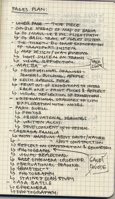
prior to the crit with tony broomhead (which can be found on a separate post) i had made some basic considerations/desires for the publication from the developed methodology. these helped me map out the derivation of the topic and its progression into being applied to the design publication.
i decided that i would begin by considering the content based on my trip to Barcelona and this would make sense chronologically and as a study of the city with a working flow/understandable progression. i thought about some of the things i wanted to include, wrote down how they could appear, then went on to establish an actual content list for the publication. i also produced a few thumbnail layout ideas to help me to dictate the placement of different content prior to making.
having completed this i selected the imagery that i wanted to include for each section of the publication, some of which is included on the blog post, and some of which was from the full library of photographs i had taken on the trip. i sized them up in indesign according to the page size and basic layout structure that i had developed and then printed them off.
i then collected all the observational sketches i had produced while on the trip and organised them with the relevant photographs and into sections so that i could access them when necessary. i decided to crop the sketches at the time of mounting so that i could better maintain the grid that each page would follow.
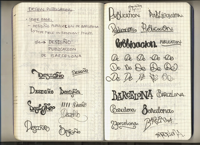
from this i went on to produce the cover sheet. since i have been developing my typography and calligraphy skills a lot this year, and being that the publication is a reflection of oneself and ones design style as well as ones methodology, i decided it would be most appropriate to produce a hand rendered type piece.
i chose the title 'designo publicacion de Barcelona' (design publication of Barcelona) a simple but effective title that worked in line with my spanish speaking, the point of the publication, and the content it would hold. i began by considering the sorts of styles that might appear well on the cover, exploring the form of each word separately and then in line with the rest.
when happy with a basic structure (i didn't want to formalise it too much because i work better when free styling a design to an extent) i proceeded to develop a grid for the letters. i then penciled in the letter forms onto the stock and from that went on to hand render the final outcome using a number of different weight fine liners.
having finalised the front page, which i could then use as a template for the other pages to check the measurements i applied to each where correct, i went on to produce the rest of the pages. since i had established in my methodology and design style; i work mainly using hand rendered and craft based techniques. being that the publication is a reflection of me and my design style/process it was clear that, in order to successfully represent myself, i should produce the publication using hand rendered and craft based methods.
i had collected a variety of ephemera, some of which was two sided or had features i wanted the audience to be able to see and feel, and so i considered a number of ways to mount such while not permanently attaching it to the stock.
while producing the MACBA section i decided that it would be best to select texts from each cover sheet i had collected from the different exhibitions. i chose texts that best represented and explained each exhibition and which were more pertinent to the imagery i had selected for each exhibition.
i had cropped and hand mounted them to the relevant pages considering grid and layout while doing so.
in the section about la sagrada familia i emphasised how captivated and in awe of the stained glass windows i was. i decided that, as a reflective and style progression page, i would produce a stained glass window of my own. the carrier bag i had collected from the shop at gaudi's casa batllo featured the scale like tiles seen on the house. i considered how the fact that both were gaudi designs, and how the translation and assimilation of different experiences was part of my methodology in a reflective sense, that the material would be perfect to use as the glass for the window.
while producing the pages for casa batllo i had decided that i would involve a sort of self produced mosaic in line with gaudi's tile work and so i cut stock out from a number of different pieces i had around and mounted them in a similar format with consideration for colour and style.
i produced the rest of the pages on a case by case basis as the flow and layout of the content was dictated by the imagery and the sketches that i wanted to include and also by the topic the pages were communicating.
i decided that, because i wanted to produce the publication with various stocks and colours of different weights, i would apply a japanese stitch bind to hold the publication. i followed the tutorial i had found which is on my secondary research post and used hemp rope (for durability and strength) in brilliant red to work in line with the spanish colours. i had cropped the stock very cleanly and by hand but decided that to formalise the publication and add a professional touch in line with the country aesthetics i would involve a red stock wrap around on the stitched fold and then overlay with a bright yellow tape to finish it off.
the final outcome images and evaluation can be found on a separate post under the same title


No comments:
Post a Comment