DEVELOPMENT -
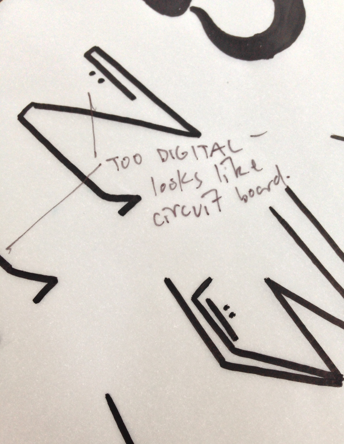
having bothed developed a number of ideas we then decided to confer about what we liked and what we didnt. noting the different accents, ears, strokes, directions, and general aesthetic features that could work within a single font. we wrote notes about what we did and didnt like and then drafted some rules in an attempt to give the font some more collective structure and noticeable constraints.
having produced a set of aesthetic values applicable to the font we then proceeded to develop the final set. because jordan had come up with what we agreed to be the most appropriate letters we decided that he would develop the final hand rendered font. he took note of both mine and his contributions and the aspects of each we thought were most successful and then developed an average of around 6 variations for each letter.
we once again confered about which of each glyph we thought was the strongest and best represetned/worked as the final collective font. i then proceeded to digitally render the chosen glyphs in illustrator to produce the final digital font useable in the yearbook. i used the live trace tool set at 100 threshold and then used a self produced grid to size and organise the final glyphs.

OUTCOME -
hvaing developed the font we tried applying it to various aspects of the yearbook as a header.
having applied it to a few different layouts we decided that it was not legible enough and did not work well enough as a header font so we agreed to scrap it.
we instead chose to use 'headline one' as the header font as it is a lot more legible and works more professionally in line with the yearbook:
while it was a shame that the font didnt work i had fun developing it with jordan and feel as though it was good practice into font development and further understanding working typography.


No comments:
Post a Comment