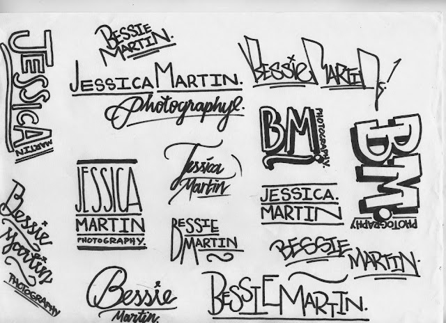
she explained that she liked the last sheet the best and highlighted the ones she specifically liked the most with little dots to the right of the logo.
i told her that some of the logos would not work well as a brand icon because they would not be legible at small sizes and qould loose their qualirty of aesthetic clarity. i decided to quickly vectorise the designs to give her a better idea of the digital versions -
she understood that and having looked theough the designs a bit more she selected a couple that we agreed woul;d work.
i went on to develop these designs a bit more formally but still hand rendered -
she was excited about these and gave the go ahead for me to digitally develop these chosen few to more formalised versions for her to then decide between
having developed the four choices digitally i produced two versions of each, featuring slightly fdifferenbt aesthetic choices. i then asked jessica to decide which she liked the best -
having had a look over the the different choices she eventually made a decision -
she chose to go with the circular bound logo design but with the crossbar of the J like the right hand version
i produced some colour variations to show the client to give her a taste of the different colour schemes that could work -
having produced a logo that the client was happy with the next step was to extend the brand logo to other relevant and useful ephemera and promotional material. this can be found on separate posts.


No comments:
Post a Comment