we had thought of a concept that involved the skylines of each city as a continuous wheel that would resemble connectivity and unity but could also be separated or highlighted to represent each poster for each individual city.
we both had a go at drawing different skylines -
liverpool -
i tried to maintain scale and realism but it was difficult doing it by eye. getting the spacing and sizing right proved more difficult than expected. jake had some similar problems and so we stopped to reflect.
we decided that producing linear resemblances of each skyline would cause considerable difficulties when trying to wrap them round a circular base. it would likely result in the image looking warped and contorted and probably not very recognisable as the skyline that it should look like. we also considered that a skyline in a straight line X4 would be too big a collective image to put on a poster and so we rethought the designs.
we decided to select a few iconic buildings from each skyline and design a semi-abstract quarter circle design. in this way, each sky line would represent the city it was meant to, it would be more recognisable, and the four way separation would lend itself better to the quarter cirlce basis.
we started by splitting the cities and then we decided i would do the pencil sketches and jake would simplify them in pen:
hull:
leeds:
liverpool:
manchester:
(this one was done by jake)
the simplified versions:
we then deicded that i would vectorise and sort out the backing colours for each image and would make sure they all lined up etc. so that jake could drop them into the poster layouts that he would develop.
i went into illsutrator and used the live trace tool to establish the basic outline vectors -
manchester:
liverpool:
leeds:
hull:
i then checked that they all married up as a single circle -
from this i went on to complete the painstaking task of drawing out individual vectors with the pen tool to go behing the different sections of each outline. these would be used to apply the colour scheme that leo had developed for his logo separation.
i then went on to apply the colour scheme -
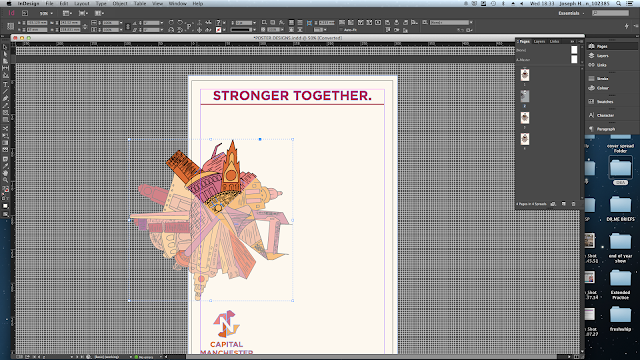
from this i reconnected the four sections of the wheel and applied a transparency to the 3 sections of the wheel that were not relevent to each city and placed the vector of the city that the poster respesented at the top of the circle for each poster.
at that point i thought that my work was done and that jake was going to complete the poster designs so i sent him the files over all ready to be simply dropped onto his layout designs.
i went away for the weekend and returned on sunday night before the presentation which was on monday. leo had developed the presentation but was wainting on jakes poster designs. unfortunately he was not able to do them and so i ended up having to do them that night ready for the presentation.
because i was in a rush to complete them i was unable to spend that much time developing the concept beyond the vectors i had produced and so decided to maintain simplicity and let the imagery speak for itself.
i went into indesign to develop the layouts and the applied both the vectors and the logos leo had designed.
having completed the designs i then applied them to the presentation that leo had designed. this can be seen on a separate post. i also decided to rpint the posters out to get some better images of them.


No comments:
Post a Comment