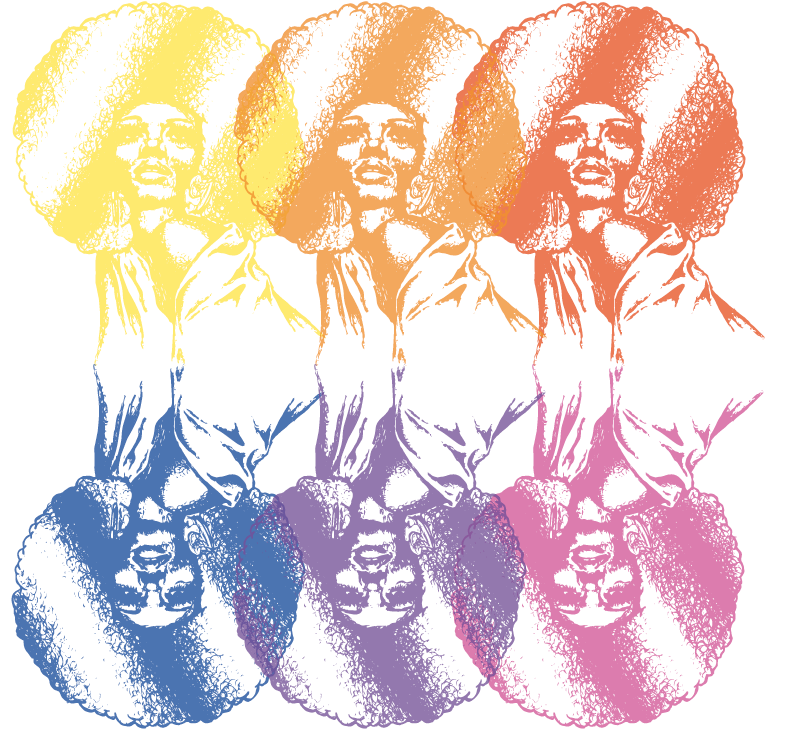
since diana ross as the head singer of the group and the iconic image of the song i wanted to draw her. i always remember seeing old supremes records at my mums house when i was younger and remember in particualr images of her with a massive afro and so wanted to draw that.
i found an image to base my drawing on:
i decided to do my own freehand rendition of the image in biro because of its textural, liquidy, and stroke qualities. biro can offer a great range of strokes and lends itself to defintion well. so , by eye, i drew the image in my own style, using curly brush like strokes hich sort of mimic afro hair and so went well with the style.
from this image i went into photoshop to alter the constrast and brightness because when tying to image trace in illustrator a lot of the texture and drawn quality was lost.
from this i went into illustrator in order to develop my digital progression of my drawing.
i then attempted to develop a tonal image from one colour however the vector basis of the live trace meant that even with the image at a high transparency clarity wasnt possible.
i then tried a number of single colour backgrounds but they also looked tacky and unfinished and so i went on to develop the drawing as a single image stencil which took some playing aound with trace settings but i got the quality i wanted eventually and then tested it against different hues and saturations of said hues.
the below example has a drop shadow of the image below it to give it further definition and oomph and i think this really brought it off the page.
i then worked on a number of gradient and colour blends within the image to test colour and placement variations.
having considered these ideas i then remembered the psychedelic oil marble effects pertinant to the era and aesthetic of the time and so decided to recreate something like this using the warp, twirl and crystalise tools in illustrator for the background.
i then overlayed the image with a lighter tone drop shadow to produce the final outcome.


No comments:
Post a Comment