Thursday, 5 March 2015

OUGD603. Extended Practice. Wall Mural for Level 6 Classroom. Research

i began by looking at quotes which might be good for the wall. i wanted to steer clear of the usual cliche 'inspirational' quotes that typographers adhere to because they are over used, do not really 'inspire' people, and loose imapct because everyone uses them.

“You have your way. I have my way. As for the right way, the correct way, and the only way, it does not exist.”
Friedrich Nietzsche

“The advantage of a bad memory is that one enjoys several times the same good things for the first time.”
Friedrich Nietzsche

http://www.goodreads.com/author/quotes/1938.Friedrich_Nietzsche

“Be yourself; everyone else is already taken.”
Oscar Wilde

 “Logic will get you from A to Z; imagination will get you everywhere.”
Albert Einstein

http://www.goodreads.com/quotes

“I love deadlines. I love the whooshing noise they make as they go by.”
Douglas Adams, The Salmon of Doubt 

“Time is an illusion. Lunchtime doubly so.”
Douglas Adams, The Hitchhiker's Guide to the Galaxy  

“Reality is frequently inaccurate.”
Douglas Adams, The Restaurant at the End of the Universe 


“He attacked everything in life with a mix of extraordinary genius and naive incompetence, and it was often difficult to tell which was which.”
Douglas Adams 


having spoken to issy we decided that this quote was the most light hearted and least cliche and would work well in the classroom as it was relatable. we decided that we would each do a typorgaphic propsal and then confer to decide upon what we thought was the best idea or combination to go forward with.

 “Time is an illusion. Lunchtime doubly so.”


i then went on to gather some visual research in the form of imagery of exisiting wall murals based around type -


http://designspiration.net/search/saves/page/1/?q=type%20mural


https://www.behance.net/gallery/11563577/Chalkboard-1


https://www.behance.net/gallery/8295845/ESDA-Chalk-Mural-%28Live%29

Beautiful type designs by Gemma O’Brien


It’s Beauty In The Struggle, Ugliness In The Success by J.Cole

Make Each Day Your Masterpiece by John Wooden
theboredkids

BIBLIOTEKET
http://serialthriller.com/


http://www.topdesignmag.com/20-amazing-examples-of-typographic-murals/


having considered some visual research i went on to develop the piece myself.


OUGD603. Extended Practice. Goodtype the Book Vol.1 Competition Brief. Research.

i decided to gather some research on the sorts of things the site showcase on social media

i wanted to gather a range of visual research and different styles but i didnt want to spend to long looking at other peoples work because i wanted the piece to be original and of my own creation and i already had a basic idea in mind of how it might look.


i then had a think about what i could write:
my favourite word to write is 'formalities'
i decided to continue with the development of the project. this can be found on a separate post called 'development'

Wednesday, 4 March 2015

OUGD603. Extended Practice. Secret 7" Competition Brief. Development.

having gathered some research into the song, and having listened to it many many times, i felt that i was able to develop a response to the song in visual form. i had an image of what i wanted to do in my head while looking and listening to the song. seen as the comp is based on ones emotive response to the song i felt like it would be most appropriate to go with my initial idea as this was my response to the song as opposed to a long winded progression of repeated and redefined ideas.

since diana ross as the head singer of the group and the iconic image of the song i wanted to draw her. i always remember seeing old supremes records at my mums house when i was younger and remember in particualr images of her with a massive afro and so wanted to draw that.

i found an image to base my drawing on:


i decided to do my own freehand rendition of the image in biro because of its textural, liquidy, and stroke qualities. biro can offer a great range of strokes and lends itself to defintion well. so , by eye, i drew the image in my own style, using curly brush like strokes hich sort of mimic afro hair and so went well with the style.


from this image i went into photoshop to alter the constrast and brightness because when tying to image trace in illustrator a lot of the texture and drawn quality was lost.


from this i went into illustrator in order to develop my digital progression of my drawing.

i bega by testing various gradients to go in line with the psychedelic themes of the song but they looked to separate to the image and drawing and looked tacky and unprofessional.


i then attempted to develop a tonal image from one colour however the vector basis of the live trace meant that even with the image at a high transparency clarity wasnt possible.

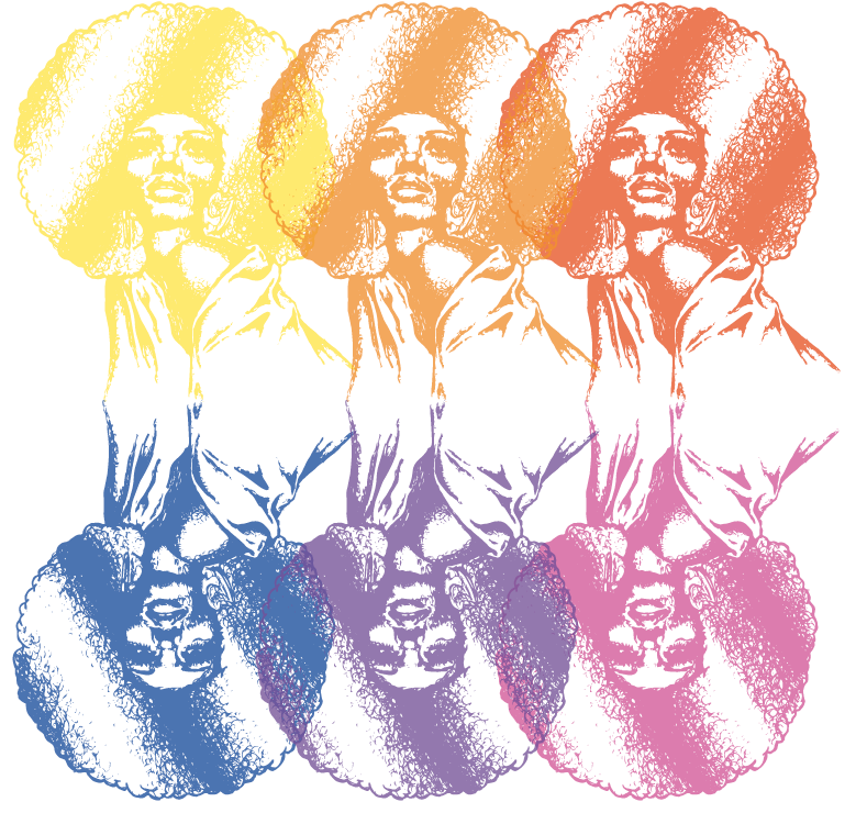
i then tried a number of single colour backgrounds but they also looked tacky and unfinished and so i went on to develop the drawing as a single image stencil which took some playing aound with trace settings but i got the quality i wanted eventually and then tested it against different hues and saturations of said hues.


the below example has a drop shadow of the image below it to give it further definition and oomph and i think this really brought it off the page.


i then worked on  a number of gradient and colour blends within the image to test colour and placement variations.


having considered these ideas i then remembered the psychedelic oil marble effects pertinant to the era and aesthetic of the time and so decided to recreate something like this using the warp, twirl and crystalise tools in illustrator for the background.


i then overlayed the image with a lighter tone drop shadow to produce the final outcome.