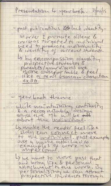
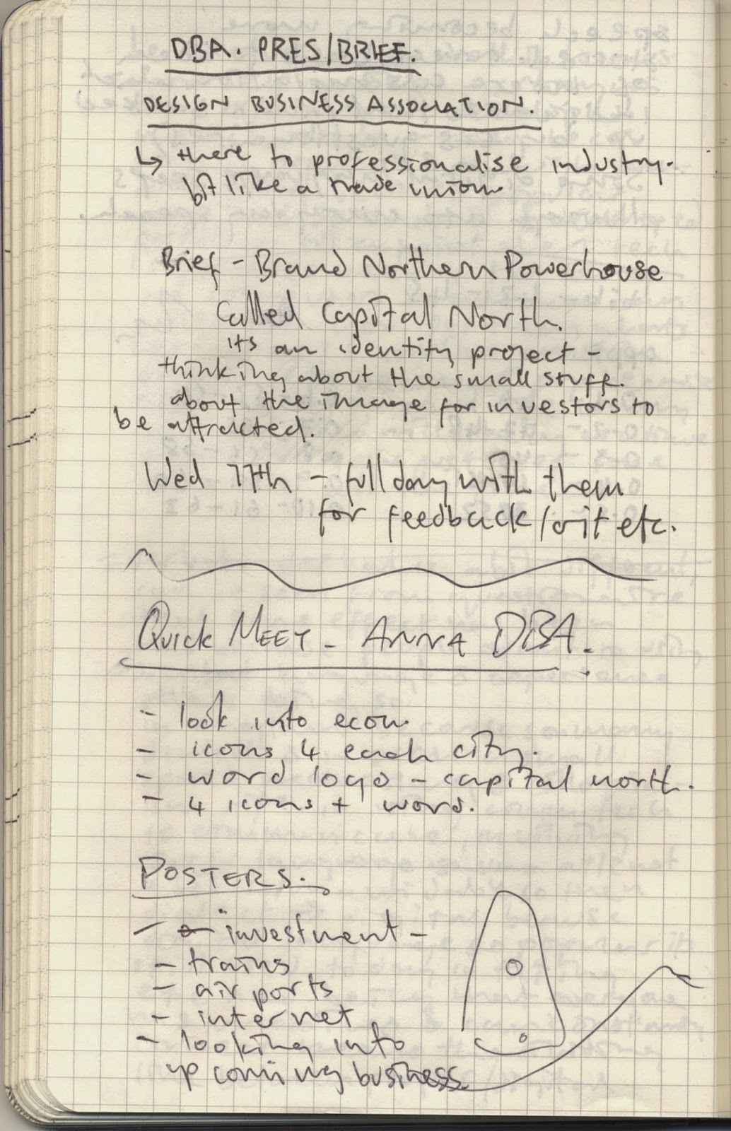
we thought it would make sense to look at some of the past yearbooks and how they appeared. while we liked aspects of each past year book we thought that certain aspects didnt work too well. some of the bios were a bit disjointed and the layout was either too messy or too simplified and cliche so we thought about how we could progress from these things.
from these ideas we went onto develop our instagram idea. we thought that a digital showcase on a social media platform that many people use would be a really good idea to get our year out there. we thought by including various works from all our students and day to day activity in the third year studio we would really be able to promote and highlight our year as a group. the benefits of this account are that it can be passed down from year to year as each third year class leaves. the base hashtag 'lcabagd' will remain throughout and the annual hashtag 'lcabagd1215' will change each year depending on the graduates i.e. 'lcabagd1316' and so on. we have already gained a number of followers and intend to progress this as a digital aid promoting the year. we will also be able to doccument the development of the yearbook itself keeping the class updated and allowing for outside and class feedback.
this can be seen on the following link:
https://instagram.com/lcabagd/
i came up with the name 'In Conscious Style' as a potential title for the yearbook. we were thinking about what defines our class and how its different to others and we gathered that many people are becoming increasingly aware of the global impact of graphic design and the associated practices. our class has become a lot more poitical and active and so are becoming more 'conscious'. we also noted that our class, while having minor disagreements and the odd tiff, are gebnerally really community based,. we are all able to tyalk to each other comfortably and so we thought this should be incorporated somehow. a final thought we discerned about the class is that everyoner has really developed and individual and wholly defining/signature style to their work and associated practices and so we thought that some reference to originality should be invoplved this came in the form of 'style'
we decided that we would each do some research into layout that we liked in order to inform our development of layout and format for the meeting we have scheduled for next monday.
we met and discussed our potential ideas and i wrote some notes -
having made some more consideration into the yearbook and end of year show we decided to delegate tasks for each of us. i was tasked with coming up with a concept for the end of year show and developing some of the promotional ephemera.
having considered some ideas i came up with a concept that i thought would work quite well for the end of year show.
since we had to consider every course that the college offers and attempt to encompass each one seperately and as a whole i needed a concept that would work in line with that. i was watching a doccumentary about chemestry and chemical compounds and the idea came to me:
- each course is a part of a whole (the college).
- each course contains disciplines within it that separate and individualise the students and their work
- each student works as an individual that collectively make up the whole course
i considered how each course could be thought of as an element. this worked because each course is the element that creates and develops each student. it also works because within each course are different practices which could each be considered chemicals which together would create the chemical compounds that are the students.
the concept worked well as a representation of the college and each course and each student and would be well suited to the design style of chemical compounds and elements within chemestry.
i did some research into chemestry and the iconogrpahy associated to it and then went on to develop some of my own iconography and logo exploration.
i began by considering how the periodic table of elements could be translated into the elements that are each course. i wanted to maintain the style and realised that i could involve the course information and name in somple but effective icons.
i decided on the name 'creative compounds' because all the students are creative but are also the creative result of the compound of the different practices and disciplines they pertain to.
i considered how a poster series and gif could work as part of the promotional material. since creativity is explosive and alive i thought a four part cartoon style gif would be interesting featuring the archetypal 'mad scientist' cooking up the elements that would explode into the show logo.

from this established basis i went on to digitally explore, develop, and formalise the iconography i had created.
using illustrator i explored the different possible formats for the logo, along with the application of different fonts and type setting considerations.
i then went on to develop the individual icons that would represent each course. we had decided to use this same style for the icons that would be featured on the poster for continuity purposes and leo used the element box idea to develop his work on the brief.
i then went on to develop some poster layouts that inlcuded all the courses and would promote the show itself. this was difficult at first because getting the layout looking good while including all the icons for every course was very fiddly and required constant revision but i got there in the end.
leo made the point that all courses should link up somehow and so this became a further consideration that i applied.
we decided that the poster would be quite flat without any sort of background and so i applied a hexagon pattern at a very low transparency to create a layer based geometric background. we considered a few different colour schemes and decided that this contrast would be striking and eye catching and so applied it.
the final design:


